Wednesday, March 29, 2017

Sourcing Inspiration Pt. 1

In the last week I created oodles of pop art inspired postcards, wrote nearly 15,000 words starting on a new novel, made major breakthroughs on editing issues I had been mulling over on one of the other novels and still found time to actually clean the house, keep up my journal and venture out to enjoy the beautiful weather outside.

When inspiration is hitting you over the head with a mallet, it is hard to believe you were ever sitting at your desk staring at a blank piece of paper like it was the world's shittiest Sudoku puzzle. It seems obvious to me right now to just write every single number on the paper in whatever fashion I like, but I know it is not always that way.

In the spirit of inspiration, and also in the spirit of wanting to get back to getting actual work done, I thought I would start a series of blog posts for things that inspire me. Expect these to pop up from time to time.


Quiet places inspire me.

Pictured is the interior of a small mill in my aunt's backyard, I spent many summers as an adolescent laying across that catwalk with my arms dangling to the lower area writing in my notebooks. The very first novel I ever started had chunks of it written there as did many of my short stories and poems all the way through high school.

Sometimes it feels like all you need to be inspired is to let the words come to you. To sit there and listen for them with nothing better to do. Little ambient noises in the background and familiar little smells. When I look at this picture I can still smell the giant container of goldfish food kept up there.


Museums inspire me.

How are you going to think of anything neat if you never see anything? The brain doesn't magically materialize ideas, it chops apart the ideas you feed it and then reassembles them. I love museums for gathering new information. The words along with the things just delights me.

This picture is from the Museum of Osteology in Oklahoma City. I was absolutely struck by this skeleton that it was one hundred percent belonging to a mermaid. For a second I was going to say I wished we could move to Oklahoma just so I could sit in this museum and draw every skeleton in it with the flesh my imagination thinks it should have.
Growth inspires me.

Seeing new things grow among the old, little trees sprouting up and establishing themselves in a several hundred year old lava flow, in the case of this image, or ivy claiming unloved buildings. Any case of plants creeping in inspires me. The juxtaposition of destruction and regrowth.

I am an avid recycler of ideas that do not quite work so I think of a lot of my writing and artwork like this. Old abandoned canvases or stories I ripped to shreds supplemented by new ideas. It is a sort of depth that makes things stronger and more interesting to me.


Weird signage inspires me.

Really any sign I see can get me wondering "why did they decide they needed to put that up" or "what's the story behind that?"

This one in particular got me because who on earth decided that "do not touch plants" was a confusing enough a concept that they needed to illustrate it? Not to mention the double negative going on here with the red slashed circle underneath the DO NOT. If you see this sign, remember to Do Not Not Poke the Flowers. They're being coy, perhaps, flirting, "oh no don't poke meeee".

Shit this post is getting weird.
Words inspire me. 

In all forms. I like hearing words. I like saying words. Sometimes I write random words down to keep or decide to use them in conversation just for fun. Sometimes I sit at my desk mumbling "schublade" under my breath.

I specifically like disjointed words. No context just the word.

I like seeing people who have single lone words tattooed on them. I like seeing signs that contain just one word. "Dip." "Bump." I like stickers that have seemingly inexplicable words on them. I'm a sucker for the mistranslated sayings that seem to come standard with kawaii stationery.

Don't even need to do anything with all the words. Sometimes just knowing they exist is enough.

Wednesday, March 22, 2017

Head Lumps

I don't get to brag about this often, but I have a remarkably unlumpy head. So unlumpy, in fact, that it's really a shame my hair is not a team player or I would keep the sides shaved. Unfortunately, when my hair gets much under an inch certain chunks of it turn a light blonde that makes me appear to have bald spots unless I rub chalk pastels in my hair, but that's another story.

I mention my lack of head lumps because this week's blog project was inspired by a swap Steph posted in the mail pals group for Artist Phrenology Charts. 

I made mine well over a week ago, but seeing her write up about the one she made resparked my interest in the whole ordeal.


As the starting point for today's project, this is the one I made for the swap.

I used an impromptu side selfie as reference to draw my own chart and painted it in gouache before using a very convoluted method of masking and x-acto knifing to fill in the little sections. It is a postcard sized piece, so I did not exactly have a lot of room to work, which is fitting since there never seems to quite be enough room in my skull for everything, anyhow. 

Since the project itself is rather personal in nature, I went for things that were symbolically important to me, but that wouldn't be weird for someone else to hang on their wall if they were so inclined. I also know there are a few people in the group who let their kids get the mail, so I decided to go for G just in case it ended up in their mailbox. 


My aim for today, instead of just making another chart, was to make a little stamp to use in my journal and probably in mail art and letters as well. A shorthand for "here's a random thought" or "this is what's on my mind today". 

I worked my design mostly off of the chart I had already drawn because I am lazy and see no reason to put the work in twice. I decided to extend the hair all the across the head and I toned down the chin because daaaaaang my chin is not that big. No idea how I missed that when I was doing the preliminary sketches. 

It occurred to me while I was tweaking the design for the stamp how much of an artistic shorthand I have developed for portraying myself. Even though this is so minimalist, and not really a great reflection of what I look like, I see it as being me because of a few quirks that show up in every drawing or doodle of myself. I think the quirks are more telling than anything I actually put as being in my head. 

The bridge of the nose (which head on I tend to draw like < > ) is because there is a running joke between my sister and I that the "family nose" is simply "broken". I broke mine when I was 3 running around the edge of a swimming pool in Las Vegas. 

Specifically using the left side of my face for profiles is because my beauty mark by my nose is on that side, as well as my eyebrow piercing and the part in my hair.  

Unkempt or bushy eyebrows (even though mine are usually in the general vicinity of "point" these days, not exactly "on point" but close enough to order takeout and have it delivered from there) are because my eyebrows are... noticeable. They wiggle around a lot and seem to make up about 70% of my facial expressions, and, when combined with well timed shrugs, 95% of my dance moves.

If I am adding color, an orange scribble suffices fine for hair, because in school a boy once tried to annoy me by telling me I wasn't a redhead because my hair was orange. I said "huh, yeah, guess so" and my hair has been orange ever since.

And that's it! That makes a me. 


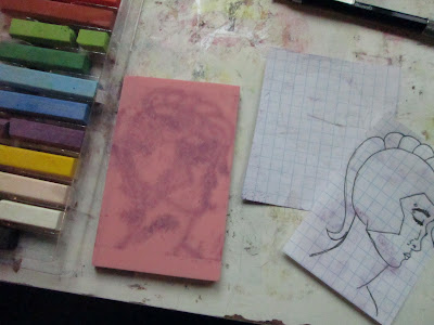
After I was happy with the design (and scribbled some mess ups out in pink since I never remember to buy white out) I taped it to the window to trace the reverse. I had no choice since we're out of printer ink, but I think this is faster anyway.


Transferring with chalk was a huge fail. Way too fine of details. Chalk everywhere. 


The sharpie bleed through method always has my back though.


The biggest problem with minimalist stamps is being tidy while carving. It's damn near impossible to keep any carve marks from showing up when you stamp, so you have to make sure every single mark that might show up looks good. I did not know this when I first started carving and a lot of my early stamps looked like they were made by a maniac or someone with the patience of a gerbil on speed (they were).


Many proofs on this one. I tweaked little things each time until I figured I was as good as I was getting. I was a little disappointed with how sharp the bridge of the nose was, if someone was paying me to do this stamp I think I would have redone it. Since it is more or less a caricature of myself though, and that is something I exaggerate anyway, it isn't the end of the world.


The final stamp on a page in my journal. I sectioned the brain off and scribbled random thoughts in it. Oh the possibilities are endless. The color that could be added, the doodles and quotes and ideas and ink splatters. I can stamp ahead in my journals, write addresses in the head noggin, or put postage there... Yeah, I am going to get a lot of use out of this little lady.

Wednesday, March 15, 2017

Anemones

We took a spontaneous trip to our local beach earlier this week, by complete and utter luck the tide was so far out that we could see all the little critters that made their homes along the rocky pier.

I took about a million pictures and my husband made fun of me for acting like a person who had never seen the ocean before or otherwise expected to never see the ocean again. I explained that they were for inspiration. And, likely because I have about 5 writing projects going right now, I actually did use one of the photos today.


I wanted to do something with this gorgeous sea anemone. There were tons of these dudes in and near the rocks, ranging from bigger than my palm to the size of dimes. I will never get over how neat anemones are, even if I am pretty sure they are the results of the unholy union between an eldritch abomination and a baked potato.


I decided a stamp would be best suited for making an anemone. I printed out my dude in black and white, scribbled on the back with a 6B pencil and began to mark the major lines.


A half hour later and not even halfway through, I decided to use the radial symmetry to my advantage and just do half. I wish I had thought of this sooner and just done a quarter but I guess the added variety in the tendrils is nice.


Slowly carving along. I actually love carving careful lines for stamps like this, it's relaxing and I can just zone out for a while and listen to music. I scribbled with sharpie the spots that needed to be removed completely as I went because I knew the tangle of tendrils would be near impossible to decipher by the end otherwise. 


Stamp carved. I was nervous to do the proof. Usually I proof, recarve, proof, recarve about 4 or 5 times before I am happy with a stamp. 


But somehow, despite the tangled mess (or maybe because of it), I liked it as was on the first try. 


I started a background on an 11 x 17 piece of mixed media paper. Toothbrush, school watercolors, salt, paper towel dabbing. I wanted something reminiscent of sand but not so textured it would distract from the stamp.


I cut it into 6 approx. 3 3/4th by 5 inch postcards and 3 atc blanks. 


Using the "buying sponges would cut into the money I need for my tea and paint habits" method, I prepared some gouache. 


You can see in the upper left the mask I used for sponging. I stamped the image on cardstock and roughly x-actoed it out. I didn't want perfect here. 


A layer of white and light blue lightened the anemone blobs a bit.


There was so much paint on the mask I did a few envelopes just by pulling a wet brush inward. 


I tested a few ink colors for stamping. I decided blue was the most striking, although I liked all 3.


Stamped the anemone details over the painted bit. Something seemed missing... 


I rubbed some of the edges of the cards with a brown stamp pad. Maybe a little subtle, but it makes a huge difference to me. 

So I ended up with 6 postcards (which will be so dapper mailed with the new shell themed postcard rate stamps).


One diptych atc set


And as a bonus, the stamp I carved very easily doubles as a dahlia type flower which I am sure will be utilized later in the season. 

And suddenly my stupid amount of "inspiration" pics feels justified. 

Wednesday, March 8, 2017

feMail

I needed to get together some mail to send out today and did my usual scrolly scroll through instagram while musing about what the hell sort of amusing mail I could assemble. After about five or six posts with #internationalwomensday at the end, I was inspired to do some feMail. 

I'm happy I thought of the pun "feMail" but also pretty pissy I didn't think of that while actually assembling these envelopes. Whatever. 


I dug out my lady stamps I have carved for various projects in the past and made some faux postage featuring paintings of women I have done. Faux postage has been all the rage lately among the mail pals. My stamps are generally pretty minimal in the "stamp" department (i.e. I don't really do the cents and "blah blah blah post" writing on mine) because whenever I try to add extra stuff it looks goofy as heck. These are no exception, but I'm happy with them. I also decided to send out the random encouraging atc's I made out of the leftover chunk of masterboard from last week's project


A little stamping on the envelopes and bam! snazzy. I did not carve the blue mystery shape, but I am in love with it anyhow and thought it was a nice contrast to the stamps I did carve. 


I poked around in my stamp stash but didn't have any stamps with women on them. Apparently I am getting dangerously low on stamps, probably something to do with the 70 pieces of mail I sent out in February alone... The cars looked nice enough with the envelopes though. 

I like the idea of small batches of themed mail. It's less overwhelming to decorate a small batch of outgoing envelopes than it is to decorate them one by one (mostly in the cleaning all this shit up afterwards department). I'm actually a little bummed I didn't have more people to send to this time as I would have loved to completely fill the outgoing box with these dudes, but I always feel that way when I pull the naked lady bust stamp out. I can't get enough of her.  

Wednesday, March 1, 2017

Perhaps

I woke up this morning to the ding of a rejection email hitting my inbox and felt an overwhelming sense of relief. I submitted a few poems weeks ago and it has been nagging in the back of my mind that my favorite concept of the bunch could have been done so much better if I hadn't tried to play it safe.

When I took my first ever art class in high school I knew eff all about art. I had a pretty solid understanding of color theory and doodled sometimes, but that was it. Halfway through the semester, we were doing landscape paintings, mine was of a castle in Scotland with a meadow and many trees in the foreground. I settled in a nice pastel almost washed out, non offensive color scheme. My art teacher kept coming by and telling me it was too light, too generic, not bold enough. She finally walked up to my desk, dipped a brush in lime green paint and smeared it across my pastel meadow. "You have to push the values." she reiterated and wandered off.

I sat, quietly fuming, for a few moments before adjusting the rest of the painting to match the awful bright green in the foreground. And she was right, the painting looked much better after I was pushed out of my comfort zone and had to be bold. Once the other values were pushed, the green she had smeared across the painting looked perfect.

I can create comfortably. I can write proficiently without shifting around and glaring at the walls and feeling like maybe I need to wash my hands or sit in the bottom of the shower with a stiff drink afterwards. I can paint and draw without someone adding splotches of bright green paint. But my strongest work in anything comes from those "oh fuck" moments. It comes from the "there is no way I can salvage this, I should just give up" moments and working through them or shelfing the project until I am ready to work through them.

Today when I got the generic, "your work is not right for us" notice I was relieved because I knew in the first draft and concept work of that poem I felt the lump in my throat and the discomfort, and that I edited all of that out in favor of something no one would probably love, but no one could really hate either. And now I have it in my head that not only do I get to rework that poem, but that I should definitely write an entire manuscript of uncomfortable poetry. I have a title all picked out and a million other things I should be doing, but who am I to hang up on my muse?

Which brings us to what I spent all morning doing, because it certainly wasn't actually writing these poems. No, I made a book to write them in, inspired by a sort of poetry manifesto I did several years ago in college.


Much like this go around, I was inspired first with a title. "Perhaps". I made a mini book (about 3.5 x 3.5, 18 pages) from one large sheet of watercolor I had mix media'd. The dirt looking stuff on the cover is tea, incidentally. 


I started with the word Perhaps and just went from there. Any time I got stuck, I wrote the word perhaps again. 


I wrote on the bus, I wrote at the pizza joint I would treat myself to any time I went to the bank, I wrote between classes, hunched over on the sidewalk, pretty much anywhere an idea hit me I was writing. 


This was also before I ever heard of zentangling. Call me a hipster but I was doodling like that before it was cool. 


"Perhaps" never was entirely finished, but some of the content was cleaned up and turned into a 3 part mini zine series a few years later. It should have been about 5 or 6 parts, but I naturally ended up distracted by some other project and now it's been several more years and I don't think "Perhaps" will ever be "finished". 

With that project in mind, but wanting a book that was a little bit bigger to fit a full manuscript worth of ideas in, I set out to make a journal.


I started with a mixed media masterboard on bristol board. I wish I had thought to take progress photos because this was one long series of "oh fuck" moments. 


Initially I had thought I would coptic bind the notebook with the pretty cover, but the idea of the inner pages being boring made me sad, and the idea of decorating a million pages made me bored. Thankfully I had one last piece of GIANT drawing paper to jazz up. 


It was unintentional how much the end color schemes resembled "Perhaps". I like what I like, I guess. 


This is the other side of the paper, before I added some watered down white acrylic to subdue the nonsense. I do have to write on it after all. 


Ah, I missed photographing a few steps after this due to tense moments. The paper and the cover were all still very damp with paint so putting the holes in tore chunks instead of neatly piercing. I added a ribbon for structural integrity purposes and kept going.


The cover turned out perfect. I just need to cut some letters out to stencil the title on once it dries. 


I love how the edges of the pages look. The entire reason I didn't let it dry was to get that damp torn look. I recall now that usually when I make these books I let them dry and then wet the edges again to tear them. Definitely works a little better... 


I need to let this dry about 50 years before I write in it now, but I am very pleased with how it turned out. I can't wait to start drafting my poetry manuscript in the free time I specifically cleared up so I could work on rewriting the two novels I am already working on... I'm pretty sure I don't even like poetry.